


We built xCloud TWO YEARS ago to solve a common problem shared by users and site owners. Many hosting platforms feel slow and cluttered. They are often difficult to manage.
Our mission has always been to make powerful hosting simple and fast. We want the process to stay intuitive for everyone. This applies whether you run one site or manage many.
Performance and reliability remain our main focus. However, great hosting requires more than speed. It also demands clarity and visibility. You need to manage your websites easily every day.
As our platform grows, we listen to your feedback. We hear a constant request for better control and clear information. You want a seamless way to navigate your hosting environment.
And that is exactly what we are delivering.
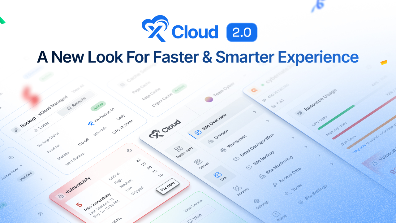
We are proud to introduce the new xCloud UI 2.0. This redesigned dashboard makes site management cleaner and faster. It is more intuitive than ever before.
This update is more than a visual refresh. It is a major usability upgrade. We designed it to deliver a seamless experience across the entire platform.
🔔 xCloud UI 2.0 is being released in phases. In this first phase, a few key pages are available, with more coming gradually as we roll out the full experience.
Why xCloud’s UI Redesign Was Necessary
What began as a simple environment for managing servers and sites gradually expanded into daily workflows involving multiple projects and ongoing maintenance tasks. With that growth, the dashboard had to support more information, more actions, and move seamlessly across different areas of the panel without friction.
Over time, this naturally increased visual density and navigation depth. While everything users needed was available, accessing the right information quickly required more effort than it should have. So, the platform itself continued to perform reliably, the dashboard needed to evolve alongside it.
We also listened closely to your feedback. A consistent request was coming, you wanted better clarity, easier navigation, and a more streamlined experience for everyday site management. Not more complexity – just a smarter, more intuitive way to work.
That is why we redesigned the xCloud dashboard.
This update is not about changing how hosting works. It’s about making everything easier to understand, easier to access, and easier to manage as your projects grow. By rethinking layout, navigation, and information hierarchy, we’ve created an interface that supports both new users and experienced site owners, today and as they scale in the future.
What’s New in xCloud UI 2.0: Smarter, Faster, and Built for Scale
When xCloud was built, the goal was to make powerful cloud hosting accessible, efficient, and developer-friendly with an intuitive panel and without unnecessary complexity.
Over time, as more users launched sites, managed projects, and scaled their workflows, one thing became clear: the dashboard needed to evolve alongside them.
The all-new xCloud Dashboard is redesigned from the ground up to be cleaner, smarter, and easier to navigate. You can now manage your sites faster, understand their status instantly, and stay focused on what matters most. Let’s take a look at a glimpse of what’s new –
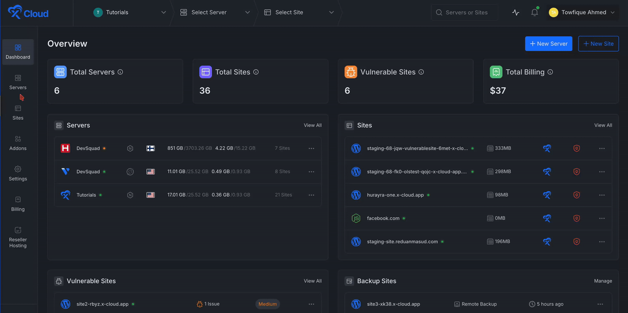
One Centralized Dashboard To See Everything At A Glance
The new Main Overview Dashboard gives you instant clarity the moment you log in. Instead of jumping between pages to understand what’s happening across your account, you now get a high-level snapshot of your entire infrastructure in one place.
Key information is presented clearly, allowing you to assess site health, activity, and overall status without friction.
From the main dashboard, you can quickly view your latest servers and sites, recent vulnerable sites, backup status, and billing overview – all right from the start.
Everything is laid out with purpose so that you can move from insight to action faster than ever
Manage All Your Sites Faster with the New Site Lists Dashboard
Managing multiple sites should feel effortless, not complicated. With the new Site Lists Dashboard, all your sites are displayed in a clean, organized layout that makes it easy to browse, search, and switch between projects.
Site statuses are now more visible and easier to understand at a glance, allowing you to spot issues or confirm everything is running smoothly in seconds. Not only that, but managing sites in bulk is now hassle-free. With just one click, you can open sites to visit, Run backups, Disable or enable sites, enable the AI Bot Blocker, or even activate the Vulnerability Scanner
That means fewer clicks, less switching, and more control. The information you need is now easier to spot, understand, and act on.
A Clearer, More Insightful Dashboard for Every Site
Once you dive into a specific project, the improvements become even more apparent.
The Single Site Dashboard has been redesigned to deliver a clearer, more focused overview of each site. Important details are presented in a cleaner layout, reducing clutter while improving visibility into your site’s status, configuration, and activity.
Everything you need is exactly where you expect it, making site management simpler, faster, and far more intuitive.
At a Glance, You Can View:
- Resource Usage – Monitor CPU, memory, and disk usage at a glance
- Backups – Check backup status, storage, schedule, and next run instantly
- Performance – View mobile and desktop performance scores quickly
- Security & Vulnerability – Track vulnerabilities, scan history, and apply one-click fixes
- Domains & Connectivity – Manage primary and additional domains with Cloudflare status
- Automation & Updates – See pending updates for plugins, themes, and core in one place
- Caching & Add-ons – Enable or disable caches and add-ons instantly
- Recent Activity – Review recent site events and actions at a glance
Whether you’re checking health, performance, or security, the dashboard now delivers the right information at the right time without distraction.
A Smarter Top Bar & Sidebar for Effortless Navigation
To support a smoother workflow, navigation across the platform has been redesigned. The redesigned Top Bar and Sidebar work together to deliver a faster, more intuitive navigation experience across the platform.
The Top Bar keeps essential actions consistently within reach, while the Sidebar provides a structured way to move through the platform.
The new Sidebar Menu delivers a better navigation experience to the users. With it, you can:
- Move effortlessly between server and site dashboards
- Access site lists and settings faster
- Stay oriented no matter where you are in the platform
The revamped top bar and sidebar reduce friction and make the platform easier to navigate and use.
Improved Dark & Light Mode Experience
Dark and light modes have always been part of xCloud. With UI 2.0, we’ve refined both to be more consistent, balanced, and comfortable for long working sessions.
Colors, contrast, and component styling are now standardized across the platform, ensuring the same clarity and visual hierarchy in both modes. Whether you prefer light mode during the day or dark mode at night, the experience remains familiar, focused, and easy on the eyes.
Tooltips & Standard Iconography
Clear visual language is essential in a control panel used every day. In the new xCloud dashboard, icons are now standardized across the platform so each symbol represents a single, consistent action or state.
Tooltips are added where context matters most, offering quick explanations without adding visual noise. This helps reduce uncertainty, improves discoverability, and allows users to act with confidence, especially when working quickly across multiple sites and settings.
A Modern Color System Designed for Clarity & Readability
Alongside functional upgrades, the new dashboard introduces a refreshed color scheme and modern design that is easier on the eyes while delivering clearer information.
System and site statuses are now more visually distinct, helping you understand conditions at a glance. The design isn’t just cleaner, it’s more communicative, allowing faster access.
This update will now deliver better contrast and improved readability with a clear visual hierarchy across dashboards.
As a result, you get a cleaner overview and can understand site states faster—without extra effort.
Bulk Actions, Filters & Smarter Sorting
Managing multiple sites shouldn’t require repetitive work. The new xCloud dashboard introduces powerful bulk actions that let you handle common tasks across multiple sites from a single view.
From the site list, you can open multiple sites at once, update essentials, run actions in bulk, and perform routine management tasks without jumping between individual dashboards. Filters and sorting options make it easy to narrow down sites by status, activity, or priority, so you can find exactly what you’re looking for in seconds.
Everything is designed to reduce repetition, minimize clicks, and give you more control, especially when managing many sites at scale.
How We Redesigned xCloud UI 2.0 (And What Guided Every Decision)
Redesigning a hosting control panel is not just about making things look better. It’s about making complex systems easier to understand, faster to operate, especially as projects grow.
As xCloud evolved, so did the way our users worked. Managing a single site turned into managing multiple sites, servers, backups, security checks, and performance tasks on a daily basis. While the platform continued to perform reliably, the interface began to carry more responsibility. More data, more actions, and more context had to coexist on the same screens.
We saw that the challenge was how information was presented and accessed.
✨Designing for Clarity at Scalability
Server and site management tools naturally involve high information density. Health metrics, performance data, backups, security settings, domains, automation, and deployments all matter, but not all at the same moment. As xCloud grew, we saw that simply adding features was no longer enough.
The real challenge was ensuring users could quickly understand what mattered most and move from insight to action without friction. Instead of applying surface-level polish, we stepped back and redesigned the interface architecture itself with a focus on reducing cognitive load, prioritizing important information, and ensuring the system could scale smoothly whether someone manages one site or dozens.
✨What We Learned?
Through extensive user research and internal analysis, we identified clear differences in how users interact with xCloud at different scales.
Solo developers, who represent about 40% of users, prioritize simplicity and speed and rarely rely on advanced configurations, often feeling overwhelmed by enterprise-level controls they don’t need.
Small teams, roughly 35% of users, need a balance between ease of use and collaborative workflows, frequently switching between multiple sites and servers throughout the day. Enterprise DevOps teams, around 25% of users, require deeper visibility, higher information density, and customization to manage complex, multi-server infrastructures efficiently.
The previous interface treated all users the same, which introduced unnecessary complexity for some while slowing down others.
✨Workflow Friction We Needed to Fix
When we analyzed common workflows, it became clear that everyday tasks required more steps and context switching than necessary. Deploying an application previously involved navigating seven screens, completing twelve clicks, and spending an average of three minutes per deployment.
Investigating server issues often required switching between five different views and manually correlating data to understand what was happening. These were not edge cases but routine actions repeated across projects. UI 2.0 restructures these workflows so deployments can be completed in three screens and five clicks, and server diagnostics are unified into clearer, more contextual views supported by AI-assisted insights.
✨Progressive Disclosure: Showing the Right Information at the Right Time
One of the biggest sources of friction in complex dashboards is seeing everything at once. In UI 2.0, information is structured so that essential details are immediately visible, while deeper controls and advanced configurations are revealed only when needed.
This approach keeps everyday workflows fast and focused while still giving experienced users full access to powerful capabilities without overwhelming the interface or increasing visual noise.
✨Consistency Across the Platform
As features were added over time, the previous interface grew organically, leading to fragmented design patterns. The dashboard accumulated fourteen different button styles, eight color schemes, and inconsistent spacing across pages.
This fragmentation resulted in more than 2,300 lines of conflicting CSS and slowed feature development by approximately 40%, making it harder to introduce improvements without unintended side effects.
With UI 2.0, interaction patterns, layouts, icons, and components are standardized across the platform through a new design system built around six core components with clear documentation. Once users learn how something works in one area, it behaves the same everywhere else.
✨Information Architecture Built for Growth
As more features are added, navigation depth naturally increases. In UI 2.0, we reorganized the platform to create clearer hierarchies and more logical groupings that scale with complexity. Dashboards now act as decision centers rather than just data displays. Users can quickly understand the current state of their sites or servers and move directly to the right action without jumping between multiple pages or losing context.
✨ Reducing Technical Complexities at the Foundation
Beyond usability, the redesign addressed long-standing technical complexities in the interface layer. The previous codebase had accumulated four years of incremental complexity, where even small changes often required touching more than fifteen files, increasing the risk of regressions.
Refactoring the UI architecture as part of UI 2.0 allowed us to significantly stabilize the foundation, reducing bug introduction rates by 60% and cutting feature development time roughly in half. While much of this work is invisible to users, it is critical for long-term reliability and scalability.
✨Built For Everyone’s Accessibility
xCloud is used in real-world, high-pressure environments, including late nights, emergency fixes, and long work sessions. Accessibility was treated as a core requirement rather than an afterthought. Internal analysis showed that 23% of users either rely on assistive technologies or work in low-vision environments.
UI 2.0 adheres to WCAG accessibility standards from the ground up, with improved contrast, spacing, keyboard navigation, screen reader compatibility, and clear focus states. These improvements make the interface clearer and more reliable for everyone, especially when managing critical infrastructure under pressure.
Designed to Scale With What Comes Next
The infrastructure landscape is evolving rapidly, particularly as AI increasingly influences how systems are monitored, optimized, and managed. Preparing for AI-assisted workflows requires interfaces that can surface recommendations, context, and insights without overwhelming users. Rather than layering these capabilities onto an already dense interface, UI 2.0 introduces a flexible and scalable foundation designed to adapt as workflows and technologies continue to evolve.
A Gradual Rollout, by Design
Because xCloud plays a central role in daily workflows, UI 2.0 is being released in phases. Rolling everything out at once would risk disrupting established routines and creating unnecessary friction.
A phased rollout allows users to adapt naturally, gives us real-world feedback, and ensures overall stability as we continue refining the experience. Each phase focuses on specific areas of the platform, helping users stay productive while the dashboard evolves based on how it is actually used.
Frequently Asked Questions
Have questions about the new xCloud UI 2.0? Here are clear answers to help you understand what’s changing and how it affects your workflow.
Can I switch back to the previous xCloud interface?
No. xCloud UI 2.0 is designed to fully replace the previous interface and will become the standard experience moving forward. It retains all existing functionality while improving clarity, speed, and usability. We recommend using UI 2.0 to take full advantage of the latest improvements and future updates.
Are all features from the previous xCloud UI available in UI 2.0?
Yes. All features from the previous xCloud interface are fully available in UI 2.0, now presented in a clearer, more organized layout. In addition to preserving existing functionality, UI 2.0 introduces improved visibility, smarter navigation, bulk actions, and enhanced dashboards that make managing sites and servers faster and more efficient.
Do I need to migrate anything manually when using the New UI?
No manual migration is needed. All your data, applications, and settings are automatically available in the New UI, just organized more efficiently.
A More Intuitive Way to Manage Your Sites – Now and Beyond
The new xCloud dashboard represents a major step forward in how hosting should feel. Every improvement was made with usability at its core. With cleaner layouts, improved navigation, and clearer visibility, managing your sites is now simpler, faster, and more efficient. Statuses are easier to understand at a glance, important information is easier to find, and everyday tasks require fewer clicks.
The result is an experience that’s easier to navigate, quicker to manage, and more intuitive for both new and experienced users. You spend less time searching for information and more time focusing on your websites.
This isn’t just a visual refresh. It’s a smarter way to work. And this is only the beginning. We’re excited to keep improving the xCloud platform and can’t wait to see how you use the new dashboard to manage your sites with confidence and ease.